Colour & interiors
How to Choose Carpet Colour in the Room It Will Live In
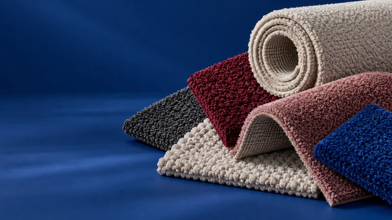
A carpet colour never appears on its own. It sits beside skirting, walls, furniture and the flooring in the next room. The most useful comparison happens in that setting, with physical samples and enough time to notice how the colour changes with the light.
Start with the things that are staying
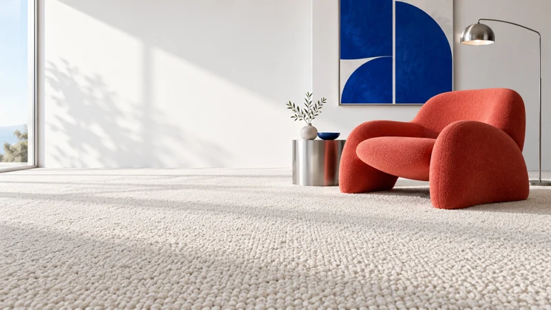
List the large elements you are keeping: a sofa, timber furniture, curtains or a strongly coloured wall. Place the carpet samples beside those elements rather than choosing a favourite in isolation. A shade can be attractive on its own and still compete with the rest of the room.
If the whole room is changing, choose one or two reliable reference materials. A real paint sample and a fabric swatch are more useful than trying to compare several screens. Decide which element should lead the palette and which should provide a quieter background.
Notice undertone as well as lightness
Two pale neutrals may look close together until one sits beside warm timber or a cool wall colour. Instead of getting caught in colour names, describe what you see in context: warmer, cooler, greener or pinker than the other sample. These comparisons are often easier than trying to identify a perfect neutral.
Do not assume a colour labelled grey, stone or ivory has a fixed appearance across manufacturers. The name is an identifier, not a colour standard. Keep the product reference attached to each sample so an appealing shade can be identified correctly later.
Look at different times and from different positions
Put samples flat on the floor near a wall and near the main furniture. View them in daylight and under the lights normally used in the evening. Move back to the doorway rather than judging only from directly above.
Also turn the sample and observe the pile direction. The same material can catch the light differently. Take notes about what you prefer, but do not make a phone photograph the final judge: the camera and screen can change the apparent colour again.
Use a small shortlist
Comparing too many near-identical options can make the differences harder to understand. Begin with a few genuinely distinct choices, then narrow the selection. For each, write a sentence about what it contributes to the room rather than simply marking it nice or not nice.
Try to separate colour from texture while comparing. You may be responding to a smoother pile or a mottled surface rather than the shade itself. Looking at those qualities separately makes it easier to explain what you want in the final product.
Check the transition to the next space
View the sample where it will meet another floor. Consider the doorway, the visible edge and the relationship between the two materials. They do not need to match, but the transition should look intentional when seen from either room.
Once the colour works, confirm the exact product's suitability, fitting and care requirements. Appearance is an important decision, not the only decision. Keep the approved sample reference with the written specification so the floor you have chosen is unambiguous.
Explore the subject: Carpets.